Table of contents
Media Center Example Designs
Now that you’ve completed the DesignCompose and the Media Center Demonstration tutorials, take a look at the Media Center app design examples on this page to get you started with your own user experience designs. You can use the same codebase to create your designs.
Switch between different example designs
In the Media Center Demonstration, you downloaded a reference app called MediaCompose_Reference_App.
To try different designs with that app, follow these steps:
To open Design Switcher, follow these steps:
-
Load the appropriate
.figfile from thereference-apps/aaos-unbundled/mediacompose/figma_files/directory and add it to your Figma account (using the Import file button on the Figma Files view). -
Use the Design Switcher in the top corner of the device display to pick an alternative design from your Favorites.
When MediaCompose is started, try the designs described in the following sections.
UX variations
These design variations were created to show the different types of UX flows you can create using only Figma interactions. Each uses a simple wireframe-like design language.
Now Playing & Browse toggle
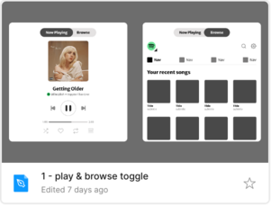
The Now Playing & Browse toggle design places the Now Playing and Browse functionality as top-level peers, with a toggle to switch between them. Drivers and passengers can either see the Now Playing information and use the media playback controls or can visit Browse to find something else to listen to. This kind of structure is well suited for small screens, which would be too crowded showing both elements at the same time.
UIs for source switching, search, and up-next tracks are implemented using Figma’s Open overlay action.
Find this design at Media1_V2.fig in the reference-apps/aaos-unbundled/mediacompose/figma_files/ directory.
Browse Slide-Up
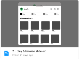
The Browse Slide-Up design presents the Now Playing functionality initially, with Browse available as an overlay, accessible using a button at the top of the screen. Since the Browse view is smaller than the full Now Playing view, this design is better suited for taller screens, so there is enough space to display Browse content.
Find this design at Media2_V2.fig in the reference-apps/aaos-unbundled/mediacompose/figma_files/ directory.
Now Playing Fly-Up
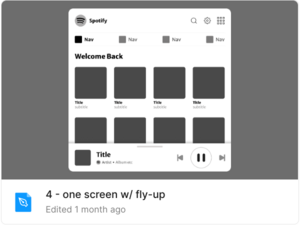
In the Now Playing Fly-Up design, Browse functionality is the primary view and the Now Playing functionality is a bar at the bottom. Drivers and passengers wanting access to extended controls or a bigger view of the Now Playing display can tap on the bar, and a larger view of Now Playing flies up to overlay the Browse view. This is a versatile design that can be used for most display sizes and form factors.
Find this design at Media4_V2.fig in the reference-apps/aaos-unbundled/mediacompose/figma_files/ directory.
Top Media Source Tabs
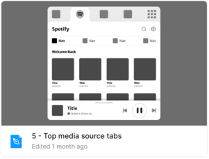
In the Top Media Source Tabs design, the available media sources are always accessible at the top of the media player, making it easy for the listener to switch between sources. Users can browse the selected source immediately below. As in the previous design, the Now Playing functionality is in a bar at the bottom, and a larger view is accessible by tapping on it.
Find this design at Media5_V2.fig in the reference-apps/aaos-unbundled/mediacompose/figma_files/ directory.
Nova
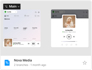
Nova is a whimsical design that delivers functionality with style. In this design, Browse is the main view with a source switcher drop-down at the top so it’s easy to select another source. Similar to the previous two designs, the Now Playing functionality is in a bar at the bottom and users can switch to the larger view by tapping on the bar. Style elements are described below.
-
The Now Playing mini-bar has expanded curved areas to accommodate a larger album art image and a Play and Pause control, making it easier to use. The top contour of the full Now Playing view is shaped to give space to the album art, while providing a larger touch area above it to close it. Because the mini-bar has an irregular shape, it’s important to make sure that the elements at the end of the Browse, Up Next and Playlist lists are not obstructed, which is addressed by additional padding in the scrolling Page component.
-
Our designer wanted to convey lightness and whimsy with this design. The background of the Browse view has a rosy wash like a sky with the first blush of sunlight at dawn. The text, such as the time in the progress bar, is in pastel multi-color.
Find this design at MediaNova_V2.fig in the reference-apps/aaos-unbundled/mediacompose/figma_files/ directory.