Variables
Figma Variables allow a designer to bind certain properties to a variable instead of a fixed value. Variables have a fixed value for each mode available in the Figma file, and can also be changed by prototype interactions, though DesignCompose does not support variables with interactions. Variables support a number of different node properties. DesignCompose supports a subset of these properties, which currently includes:
- Fill color
- Stroke color
- Gradient stop color
- Text color
- Text size
- Text weight
- Corner radius
In order to change a variable value in your application, DesignCompose has several functions to help with this.
However, developers must have a full seat in an Enterprise org to use the Variables REST API. If a design file uses variables, developers need to use a figma auth token that has the file_variables:read scope to be able to download the variables. If developers are not part of an Enterprise plan or use an auth token that doesn’t have access to variables, the design will use the node values directly, and the variable functions below will have no effect.
Material Theme Builder
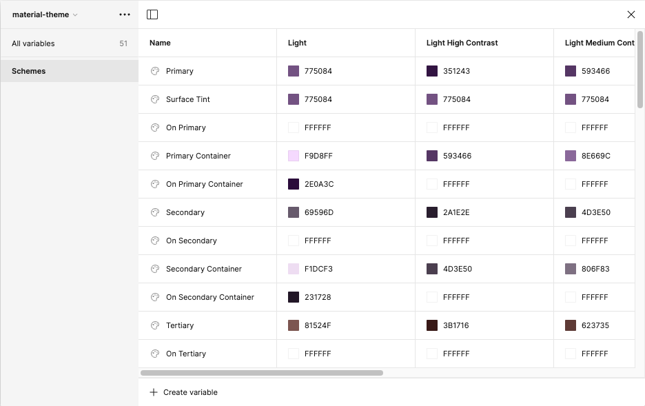
The Material Theme Builder plugin allows a designer to choose a source color or image, and then generates a palette of colors that fit into the [Material Design 3][6] design system. The plugin creates these colors as both Figma styles and variables. Variables are grouped into collections, and by default the plugin creates these color variables under the “material-theme” collection. Additional custom themes can be created with the plugin, with each custom theme resulting in another variable collection. To get the most out of DesignCompose support for variables, set your nodes to use colors from these generated variables. Here is snippet of what the variables look like:
Changing the variable collection
Each theme created by the Material Theme Builder plugin creates a set of variables in a collection. DesignCompose supports changing this collection at runtime with the function:
fun DesignVariableCollection(collection: VarCollectionName?, content: @Composable () -> Unit)
Where collection must match the name of a variable collection in Figma. For example, if nodes in a Figma design are set to use colors from the default variable collection “material-theme”, and another collection “my-theme” also exists, this can be changed to “my-theme” at runtime by calling:
DesignVariableCollection("my-theme") { content() }
Changing the variable mode
Each variable can have a fixed set of values for each mode that exists. The Material Theme Builder plugin generates six modes for each color value: the main modes “Light” and “Dark”, as well as high and low contrast versions of these. A common usage for variables is to change the mode between “Light” and “Dark”, causing all nodes bound to variables to change their values to the specified mode. DesignCompose supports changing the mode with the function:
fun DesignVariableModeValues(modeValues: VariableModeValues?, content: @Composable () -> Unit)
Where modeValues is a hash map that maps collection name to mode name. For example, if nodes in a Figma design are set to variables in “Light” mode, this can be changed to “Dark” mode by calling:
DesignVariableModeValues(
    hashMapOf("material-theme" to "Dark")
) { content() }
Using the device’s MaterialTheme
The Material Design 3 system allows an application to load a different MaterialTheme at runtime. If a Figma design uses variables built from the Material Theme Builder plugin from the collection “material-theme”, these variables can be overridden at runtime with a different, developer-specified MaterialTheme. DesignCompose supports overriding the Figma Material Theme with one at runtime with the function:
fun DesignMaterialThemeProvider(useMaterialTheme: Boolean = true, content: @Composable () -> Unit)
For example, this changes everything in content() to use the MaterialTheme described by myColors, myTypography, and myShapes.
DesignMaterialThemeProvider(useMaterialTheme = true) {
    MaterialTheme(colors = myColors, typography = myTypography, shapes = myShapes) {
        content()
    }
}